How I Made a Large Painting Resonate on a Personal Level
Here’s the story of how I created a large painting that connected with viewers on an intimate level. This piece is one of the largest paintings I have made so far. This 2020 commission is a great example of one of my strongest collaborative efforts to date. I am so grateful to everyone I worked with on the project to make it a success.
This project began when Amanda Hill, a Dallas interior designer, contacted me about a project for a law firm. We met in the design district and went over the firm’s floor plan so I could see where the painting would hang as a focal point.
About a week later, I met with the partners of the firm to discuss ideas. I made a sketch that was based on color ideas I had discussed with Amanda. The main visual inspirations for this painting were drawn from a couple of pieces I created in the past. “Can You See Me” from 2006 and the “Family Tree” paintings from 2009 drew the attention of both the designer and the clients.
Based on their input, I made a few scaled-down maquettes. I also went to my father’s studio to build the frame and stretch the canvas from scratch.

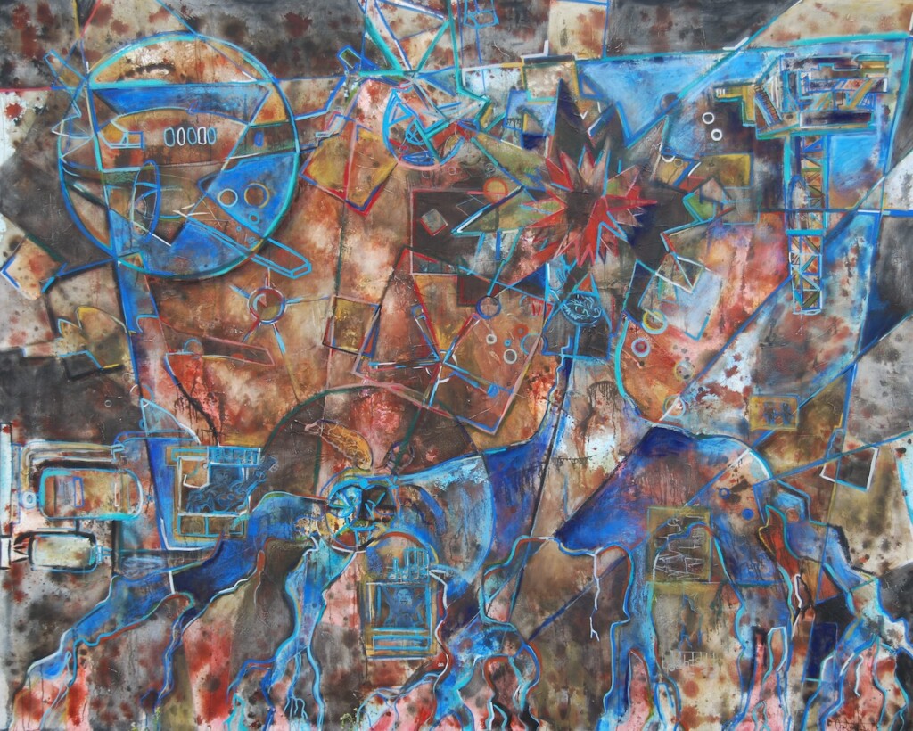
“Gimme Shelter”
96 in. X 120 in.
Mixed Media on canvas
2020
Inspirations and developing a story
As with many of my commissions, I try to create a personal connection with clients by learning about their interests. Some of the inspirations for ideas in this painting came from unexpected places. I was given a rough idea by the client of what they wanted in the painting, which included references to “artifacts” from their cases. This firm is primarily a large-scale personal injury law practice.
I was surprised to hear that they wanted to cover some dark territory, which made sense given the visual tone and direction of the painting. They made references to accidents on planes, oil rigs, and pipelines from past cases. When I am given an unexpected tone to work with, it’s usually a fun and interesting challenge.
Protection of familial roots
The client also wanted to convey a theme of family and familial roots. The concept revolved around their roles as protectors of their client’s well-being and included a large set of roots that extend from a chrysanthemum flower, which represents hope. The roots are more obvious and are heavier on the blue side.
I ended up making the top floral shape more psychedelic and abstract. It was meant to be symbolic and less of a focal point. This direction was the result of a mix of the designer’s feedback and my own personal creative choices.
There are a couple of notable icons in the lower middle section that are worth mentioning. A sea tortoise sits semi-hidden just towards the top of one of the roots. The tortoise represents wisdom, patience, and protection in some cultures. The scales of justice are also “hidden in plain sight” among the shell of the tortoise. I got this idea from discussing icons with the client.
Applying lessons from previous paintings
In our meeting, we discussed a past painting I had made for a law firm that included heavy references to law. We both agreed that if I included any references of this type, it would have to be subtle. While I am proud of the painting I made earlier in my career (“Risk + Chaos = Opportunity”), I got an important lesson from that experience. The law firm that the painting was pitched to didn’t like it due to the obvious references to law.
In some cases, I have found that people don’t want to be reminded of their work. In this particular case, the clients challenged me to explore what made their lives meaningful through their work. I really appreciated that level of openness.
In an effort to be subtle, I “hid” the scales of justice on the back of the tortoise, with the tortoise being a symbol of protectiveness and wisdom. That “hidden element” tied the concept of the painting together.
Current events as an influence
Another idea that found its way into this painting came during the early days of the COVID-19 pandemic. Italy had been (up to that point) the nation worst affected by this disaster. Despite that, many people were singing and playing music with one another from their balconies.
Many cities in Europe have apartments and homes that are close in physical proximity, so it’s easy to see how this would happen. I was inspired by the notion of people connecting through something they can mutually love and express together. This passion for life resonated with me and provided a positive element to a situation that has been extremely difficult for everyone. Art and music are crucial in maintaining a sense of humanization in society. The fact that this happened under such duress helped me to connect the dots in my own painting.
Musical influences
As it turned out, I shared a mutual passion for music with the client, which informed the energy and narrative of the painting. I included the first three bars of the song “Gimme Shelter” by the Rolling Stones. The urgency and energy of that song kept playing in my head as I painted. Although the meaning of the song bears little literal relation to this painting, the general feel is still influential in this work. Musical influence has always been a way for me to personalize my artwork.
The clients also mentioned their interest in the band Tool. Since I have followed this band’s music for some time, there is crossover in the way that the band’s songwriting informs a narrative with their dense and abstract symbolism.
Combining nature and industrial elements in the sketch process
Throughout the process of idea creation for this painting, I made three sketches that combined elements of nature and industrial structure. The industrial elements were intended to be center stage, but I also felt a bit of nature would be a nice counterbalance. The dominance of abstract elements versus nature versus industrial elements varies depending on the sketch. Luckily this is where forming ideas in a sketch context helped to inform the final product. With the input of Amanda, I was able to make calculated choices about the placements of elements, as well as the visual dominance of certain ideas in the painting.
Sketch one

While working on this project I created three sketches. This informed the ideas that I put into the final artwork.
The first sketch was not part of the final work, but some of the color choices ended up making their way into the central area of the finished painting. This painting had a lot of reds, and working warm colors into the center of the final painting helped to “open up” the painting, allowing the mind to rest with open visual space. The earth tone color scheme of the center of the final painting is where some of my father’s influence shows up. I’ve worked with him on a number of furniture antiquing and finishing projects over the years. I used that influence to approach the treatment of my earth tones.
Sketch two
The second painting helped me see that I needed to have a linear structure to guide the viewer between various points of interest in the composition. This sketch also showed me that it was a good idea to play with the visual depth of certain elements. Some icons and elements can be more forward or can fall into the background. However, some elements tended to be too far into the background in this sketch for my liking. I made a mental note to be aware of this as I moved into the final piece.
Sketch three
The third sketch was more nature-centric. The blues were much more dominant, almost too dominant. I got really into making this sketch, and I didn’t force myself to pump on the breaks soon enough. Again, this is part of the process of forming ideas. I knew now that I had to tread carefully and take my time.
The root structure of the third sketch played a huge part in what I ended up creating in the final painting. This is where my mother’s influence shows up. She’s a horticulturist and a landscape designer, so I grew up learning a lot about how plant life grows, and how root structures expand. I ended up hand-rendering the root structure as opposed to how I translated some of the other iconographic concepts.
Transferring drawings to large scale
As with many of my recent works, I transferred drawings I worked out via a light projector. The plane, oil tanker, and oil pipelines were sketches based on images the client sent me after our initial meeting. Being able to translate these technically complicated drawings in this manner helped to elevate this painting. The plane and the oil tanker were transformed from a more standard abstract painting to a work of art that combines abstraction and traditional techniques.
Having the right tools also helped to scale this painting and make it feel more intimate. I could have easily turned a painting that is 8 ft. x 10 ft. into something that’s infinitely more complex, but that wouldn’t have been as inviting or engaging as the composition in the final artwork. It’s just the right balance between visual information and open visual space. Speaking of visual space…
Art materials used
This painting utilized many techniques I have worked with in the past, but I tried a few new approaches this time. The base of this painting is primarily acrylic. The darker elements are a mix of acrylic in some areas and water-soluble graphite in others. There are also various soft and cray pas pastels utilized throughout the painting, which I used a combination of Spectrafix and aerosol spray fixative to set. I also experimented with a very minute amount of oil paint in a few parts to see what I could do to enhance the colors. Despite being a visually versatile painting, the mixing of mediums in this painting was kept surprisingly minimal compared to my other art. I ultimately finished the painting with a finishing spray to protect the work.
Making large scale feel intimate
I’ve always been an artist that feels more comfortable at a larger scale, but moving to this size was intimidating at first. Even though this was made for a large space, I wanted this piece to have a sense of visual space that the viewer could feel comfortable exploring.
Having this kind of scale to work with forces one to consider how important a sense of space is in terms of how the mind processes visual space. I intentionally left the central area a bit more open. In contrasting the black, blue, and neutral tones in the outlying areas, I created a sense of warmth and dimension. I’m happy that this painting feels like something that could easily fit in your living room at home as much as it does on a large wall in an office.
The client now has a bold piece of art that helps to tell their story to current and new clients alike. I’m very proud to have been involved in the creation of this art.
Special thanks to the team at Lyons and Simmons LLP, Amanda Hill, my father Michael Stallings for helping me make this painting a success!
[/fusion_text][/fusion_builder_column][/fusion_builder_row][/fusion_builder_container]

