How I developed a more ‘minimal’ approach for my new art commission.
I was invited to create new art for a previous client at Lyons and Simmons LLP in late spring early summer 2023. The primary input I received from the client was to make art that was ‘more minimal’ than my normal approach. As a law firm, they also liked the way I incorporated iconography from their cases.
Given that I had a pre established working relationship with this client from a project in 2020, I knew that I would be able to confidently approach the project from an informed perspective. This could be seen as a good challenge to re examine my approach and grow in a positive direction.
How I relate to minimalist art.
While I would never call my art ‘minimalist’ I’ve seen a need to grow and allow areas in my compositions to breathe. I respect an artist like Donald Judd, but emulating his type of art isn’t necessarily my aesthetic or inclination. Compositional clarity would be the goal. A direction like this would allow for me to explore more visual dynamics. Striking a balance between this direction and my normal tendencies in rendering and mark making.
Measure, measure, measure. Then measure again.
Based on what I learned from an experience creating my first commission with Lyons and Simmons in 2020, I measured as much of the space as possible. I examined dimensions of the freight elevator, the office doors, and the entire wall on the right hand side of the lobby on the 12th floor. After careful consideration with the client, we concluded the right placement, and thus the appropriate scale of the finished art.
A unique wall finish.
This wall finish was completely unique to any project I had created art for previously. The overall finish was dark with a lot of silver, and bronze like textures. While this combination might not be typical for my style, I intentionally saw it as an opportunity to explore new direction. I chose to concentrate on creating a distinct atmosphere that would be an appropriate for the final artwork.
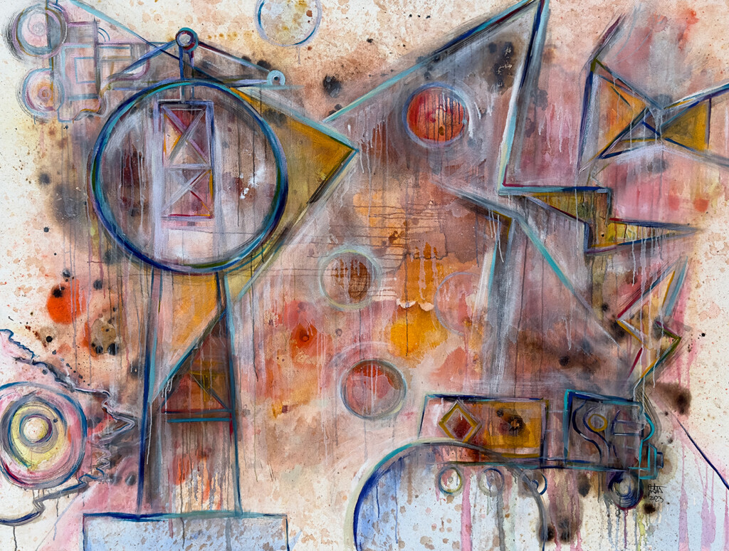
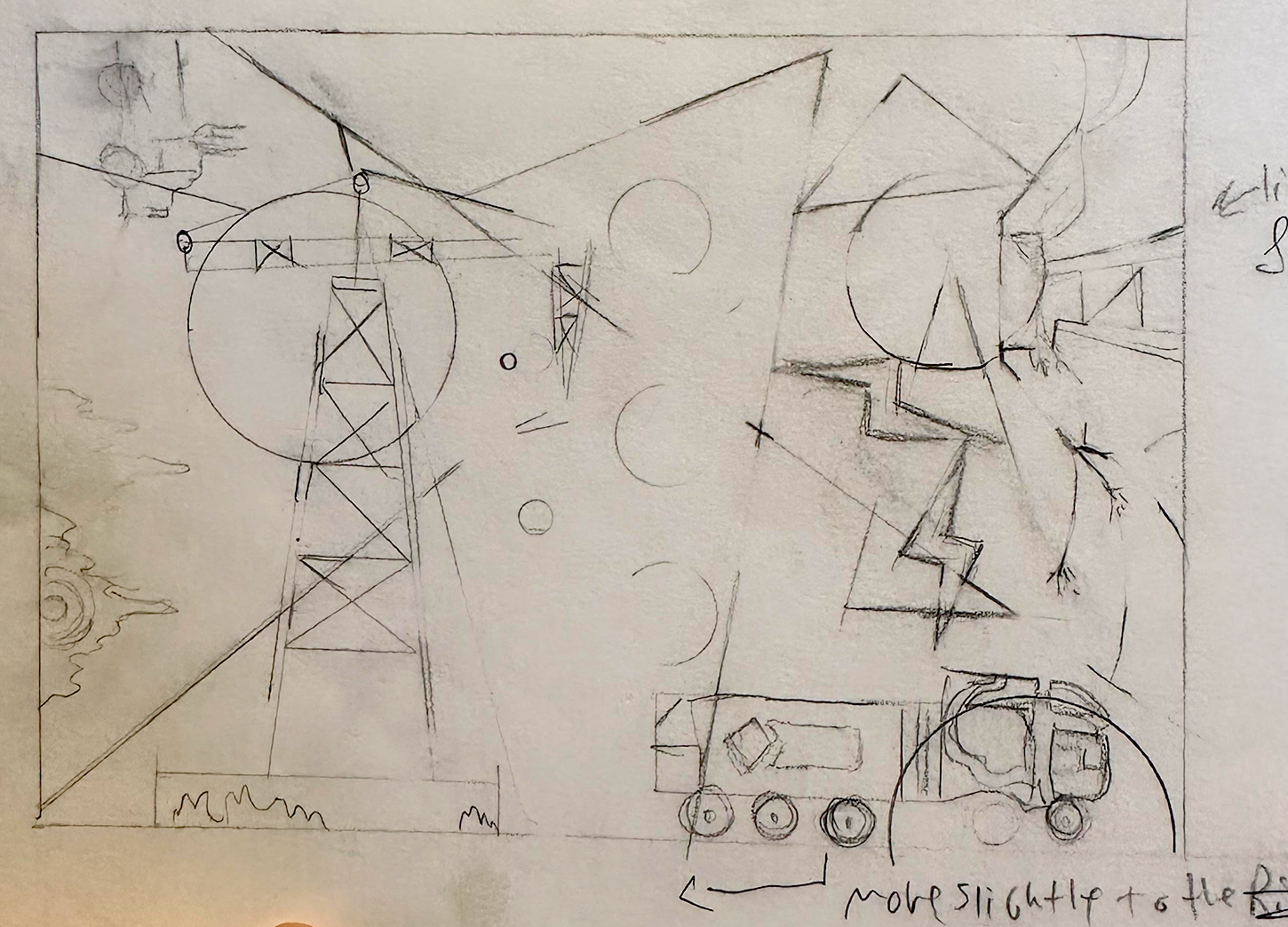
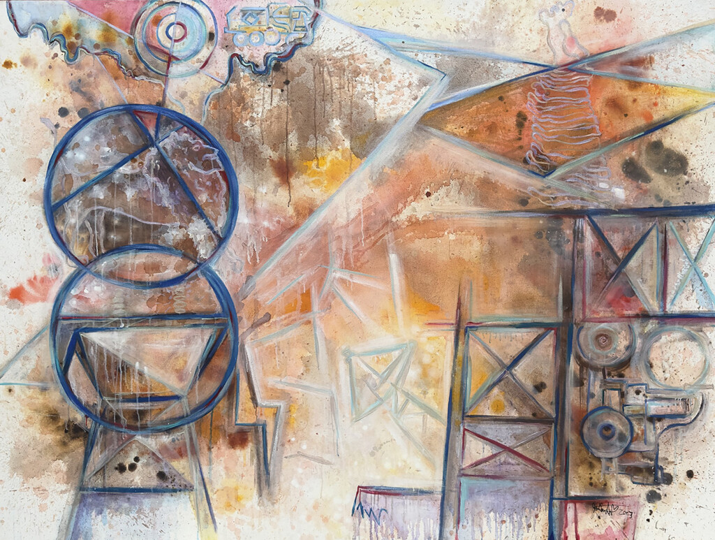
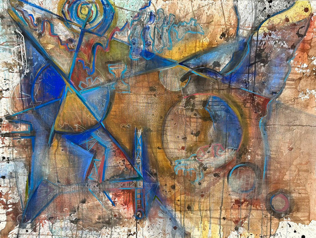
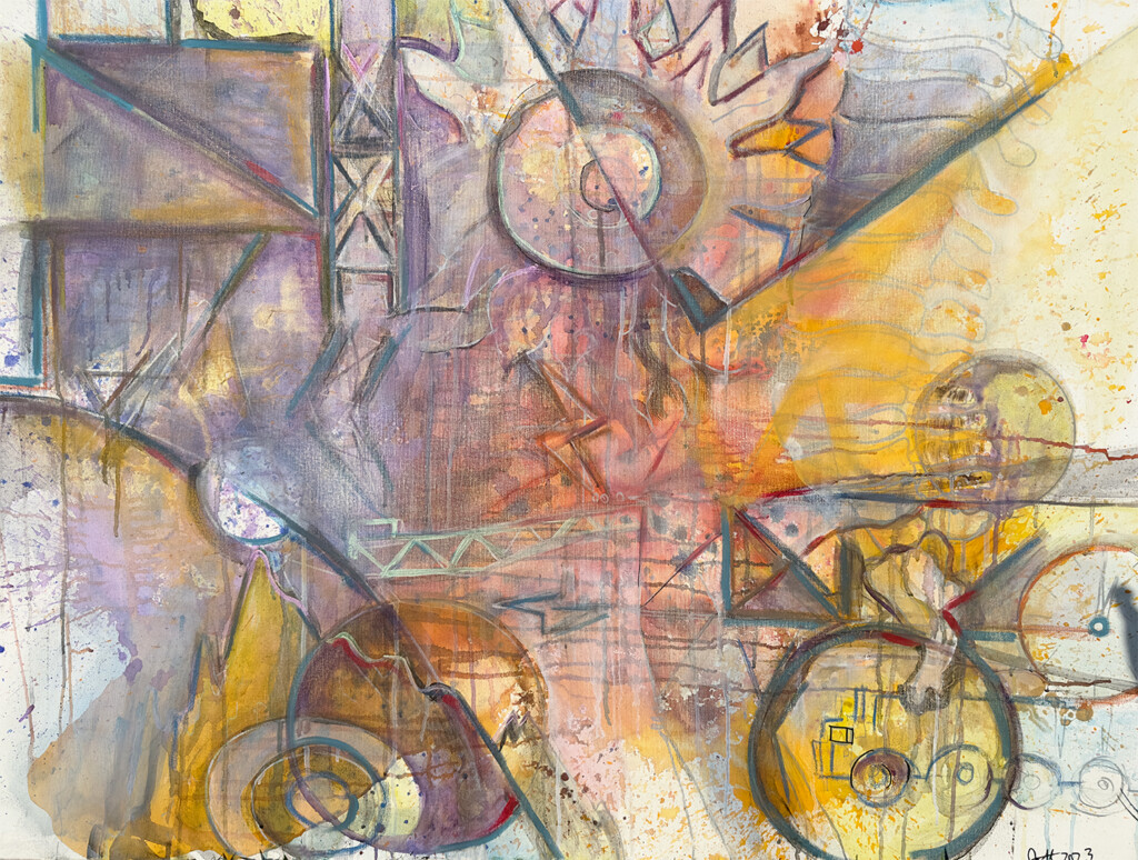
Though this is the second painting I created, it represents the first idea. Sort of a ‘recollection of events’ or a ‘preponderance of evidence.’ To simplify, I titled the 72” x 96” painting ‘Preponderance.’ The composition for this painting was formed from a fairly quickly drawn sketch.
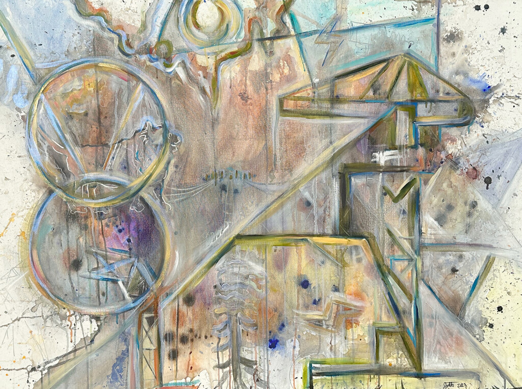
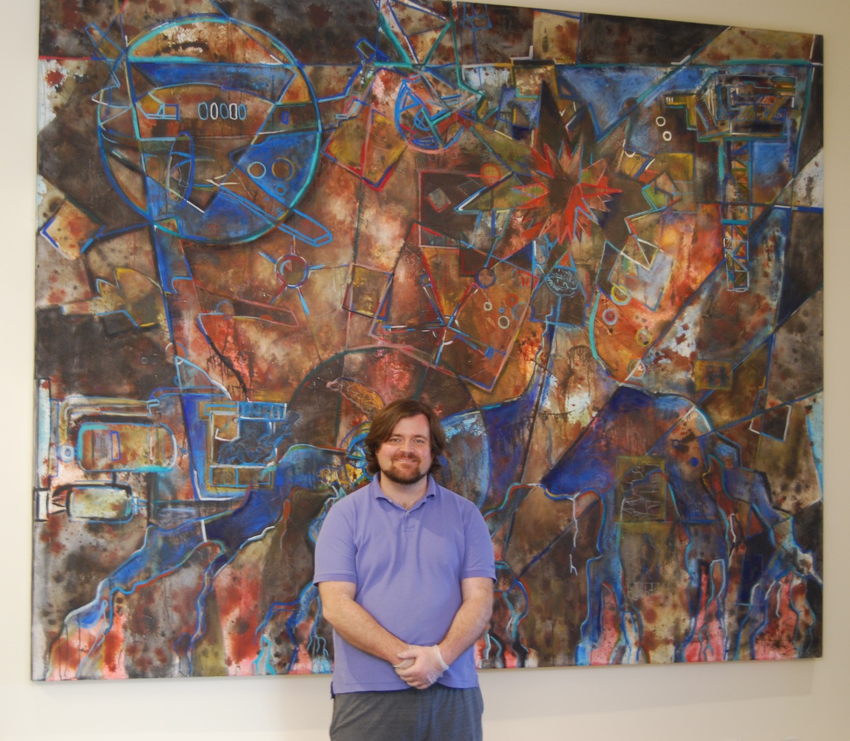
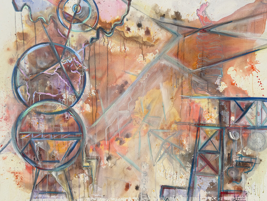
While this is the first painting I created, after creating both it sort of felt like the second progression if there is any kind of narrative to these paintings. This representing ‘order’ or what evidence might portray beyond the shadow of a doubt. To simplify, I titled the 72” x 96” painting ‘Beyond a Shadow.’
The planning stages.
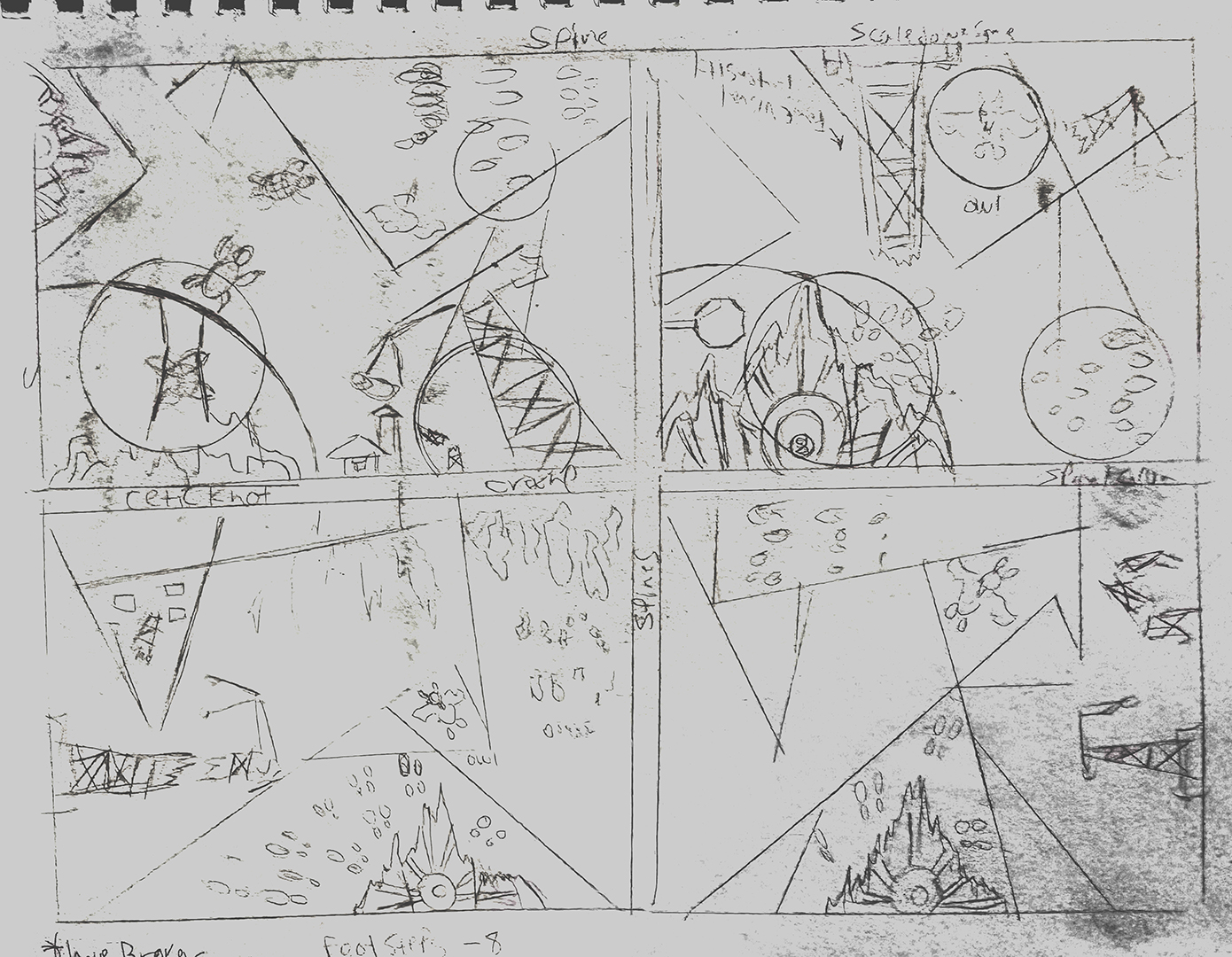
To crystalize my vision for the final artwork, I compiled a list of words connected to the cases I studied, along with numerous pages of preliminary sketches. Following that, I produced several smaller compositional concept paintings, each measuring 36” x 48”. The entire planning and idea generation phase spanned approximately 3 to 6 weeks, while balancing other work commitments. Each painting would end up being a progression that lead into the next, or at least that ended up being the result.
About the client.
Lyons and Simmons LLP cover a variety of major personal injury cases. To get up to speed on what they are working on, you can view their website here. This ranges from vehicular to medical, public events, to oil industry related cases. In the years that I have worked with Mr. Lyons and Mr. Simmons I have gotten a sense that they genuinely care about the safety and well-being of their clients. It’s been a genuine pleasure to work with them to create art that tells their story, and I cannot begin to express my gratitude for their continued support.
Ideas referenced in the art.
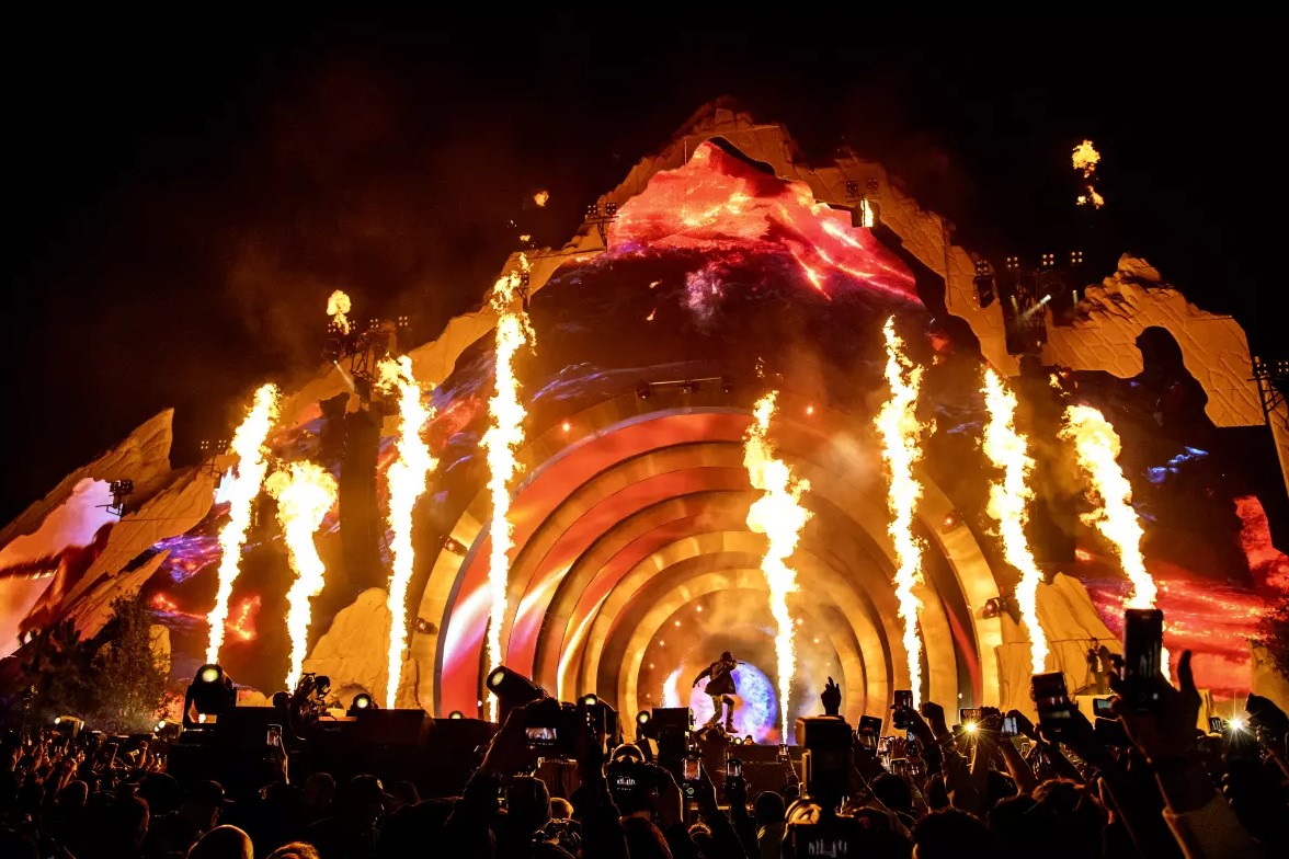
A few examples of the cases I referenced can be seen here, here, and here. The ‘mountain’ reference to the last case being the most abstract until you see the actual concert stage it references. Because of the nature these events I wanted to exercise tact and approach the creative process for this commission in a respectful manner. References to electrical lines/towers, large industrial cranes, and large industrial vehicles are also present as they relate to their cases. Another major thematic device relates to cranes being in different stages of breaking down. There’s a running theme of collapse and rebuilding running through the piece.
Striking the right balance in tone for the project
Given the nature of the topics covered, a delicate balance was needed for this piece. Nothing too heavy handed, but nothing too light either. The painting had to feel positive in tone. My thought process involved how the two paintings progress between one another. One painting portrays an impression of events before moving into the legal process. The other painting portrays the law firm providing order and structure. I know this sounds somewhat vague, but it’s easier to show this kind of thought process in a visual format than a written one.
This brings me to my next point about portraying mood over specifics. Long term I chose to keep the ideas and the ‘narrative’ of the piece more open ended than the previous commission. Atmosphere would express the emotional core of the art.
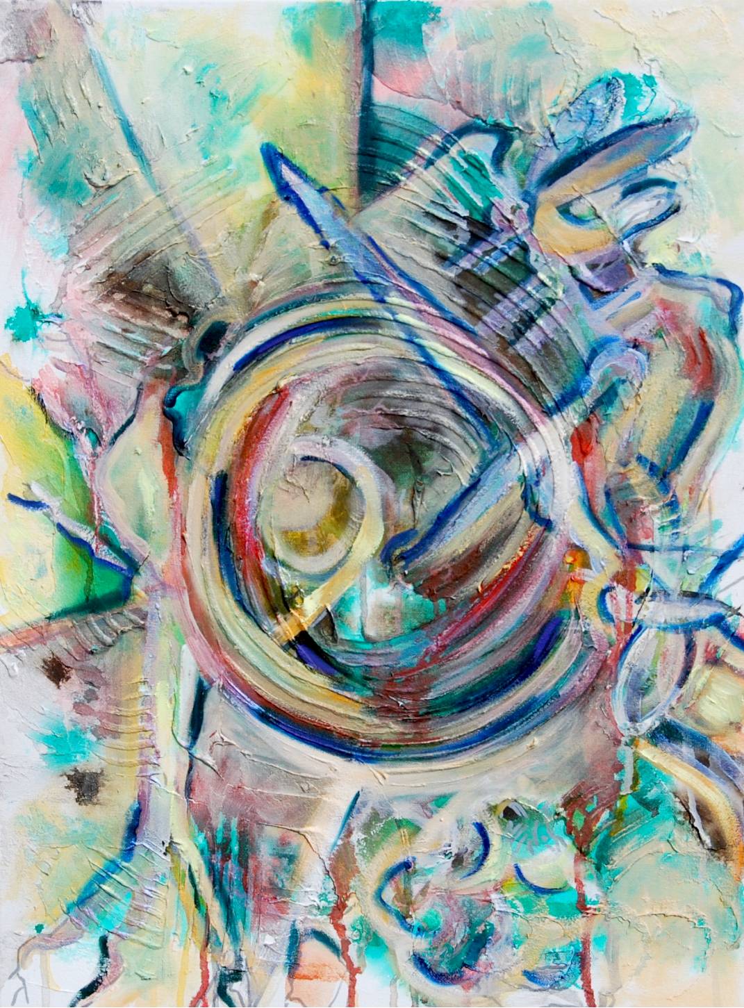
A strong start, but I didn’t quite want to call it done yet. While I would have been happy to re-create this in a larger context, the warmth of the later pieces felt more of a fit. Compositionally I really love this piece.
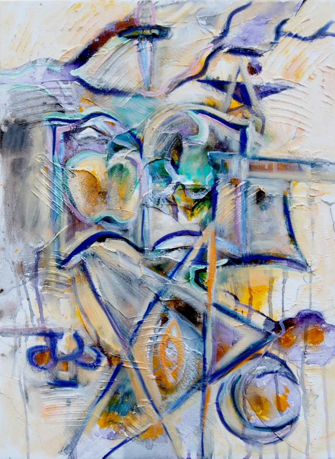
Not a bad vsiual statement, but maybe a little too similar to the previous painting and too dark for the space. I could probably explore more of this approach in a future piece with a bit more confidence given more repetition.
Looking back at previous paintings for inspiration, then deviating from that influence.
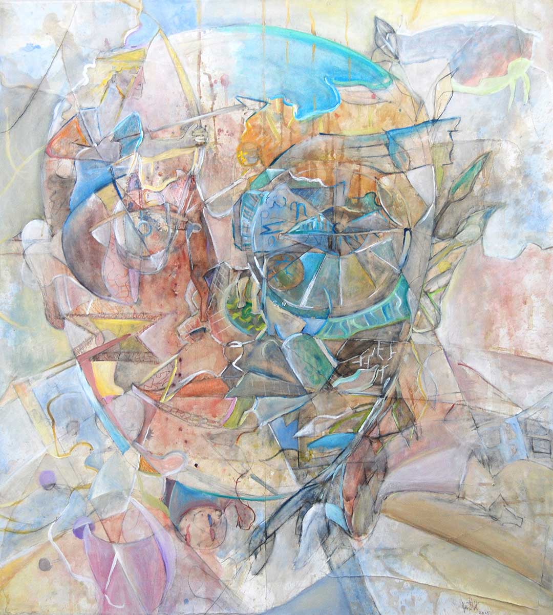
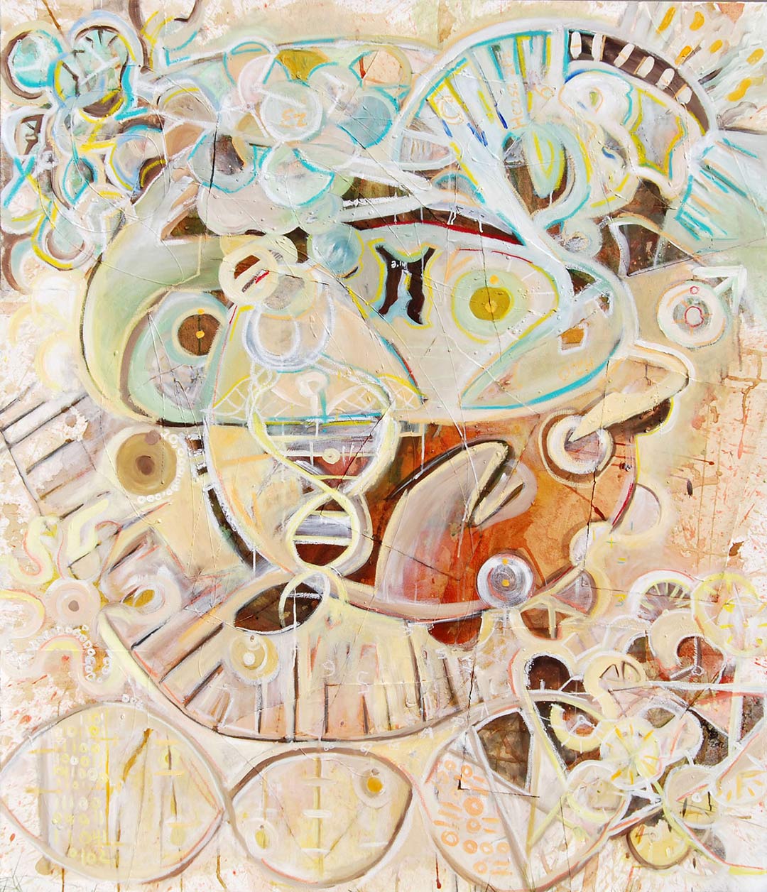
The first concept painting was more of a ‘white on white’ style painting similar to my early pieces ‘Passion and Reason’, ‘Sentience’, and ‘Curiosity’. A second concept piece was similar to the ‘Gimme shelter’ commission I created for the firm. Creating the third proved to be a complete anomaly, but it showed me what I was missing from the first two. There’s a warmth and humanity that needed to be projected in this piece. All that was needed for the final piece was a little more intentional precision.
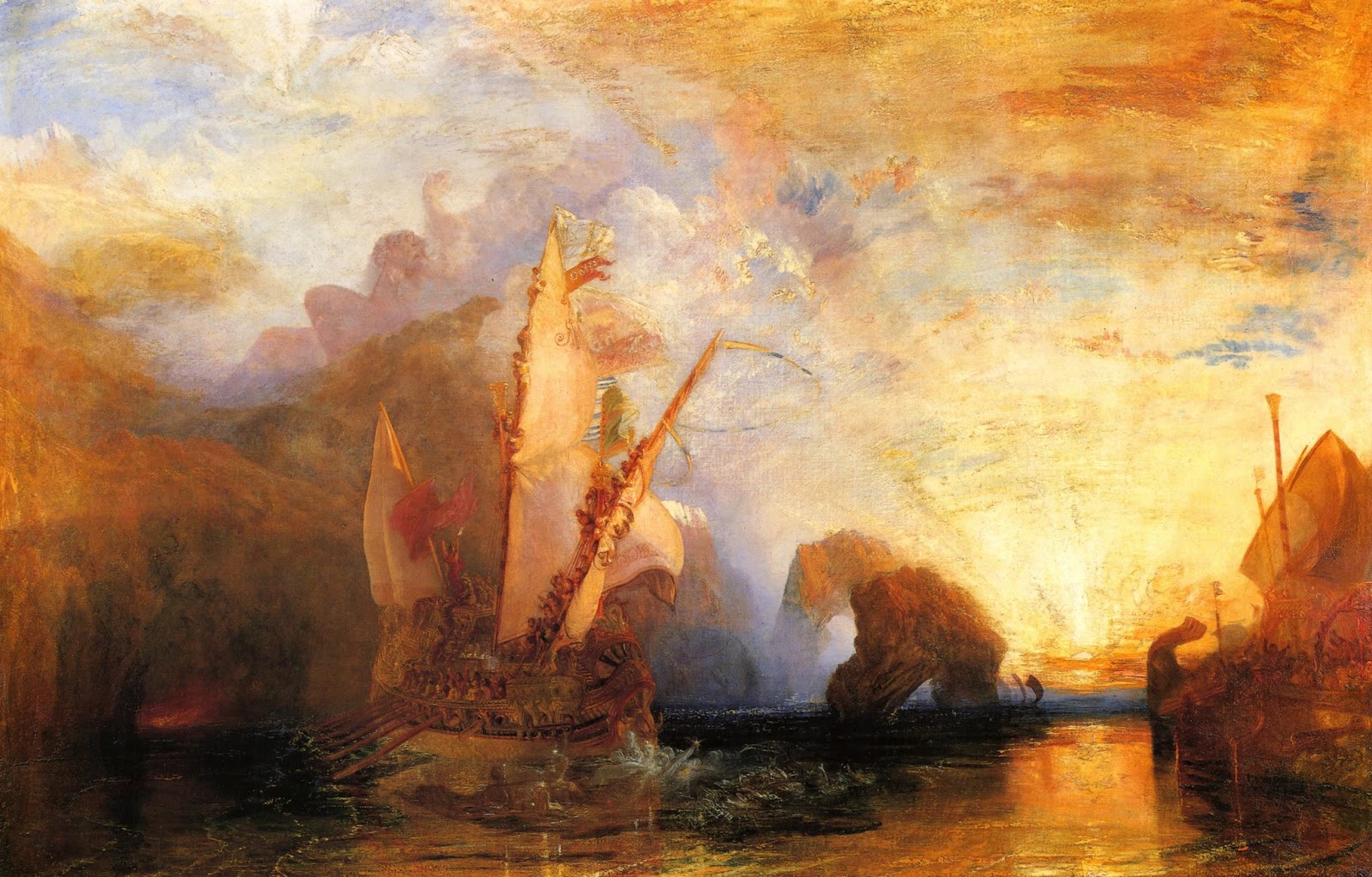
Getting inspiration from the environment.
One hot and somewhat stormy summer afternoon I witnessed a beautifully contrasting sunset. This reminded me of the work of Turner’s sense of atmosphere. The fourth piece, which ultimately informed what I envisioned for the finished piece called back to the compositional explorations of the first piece, but with the color tones of the third piece, but with some lighter subtler tones.
Although not my general intent, there was somewhat of an influence from Turner’s art for the acrylic pour that would form the ground and major influence of the atmospheric quality of the piece.
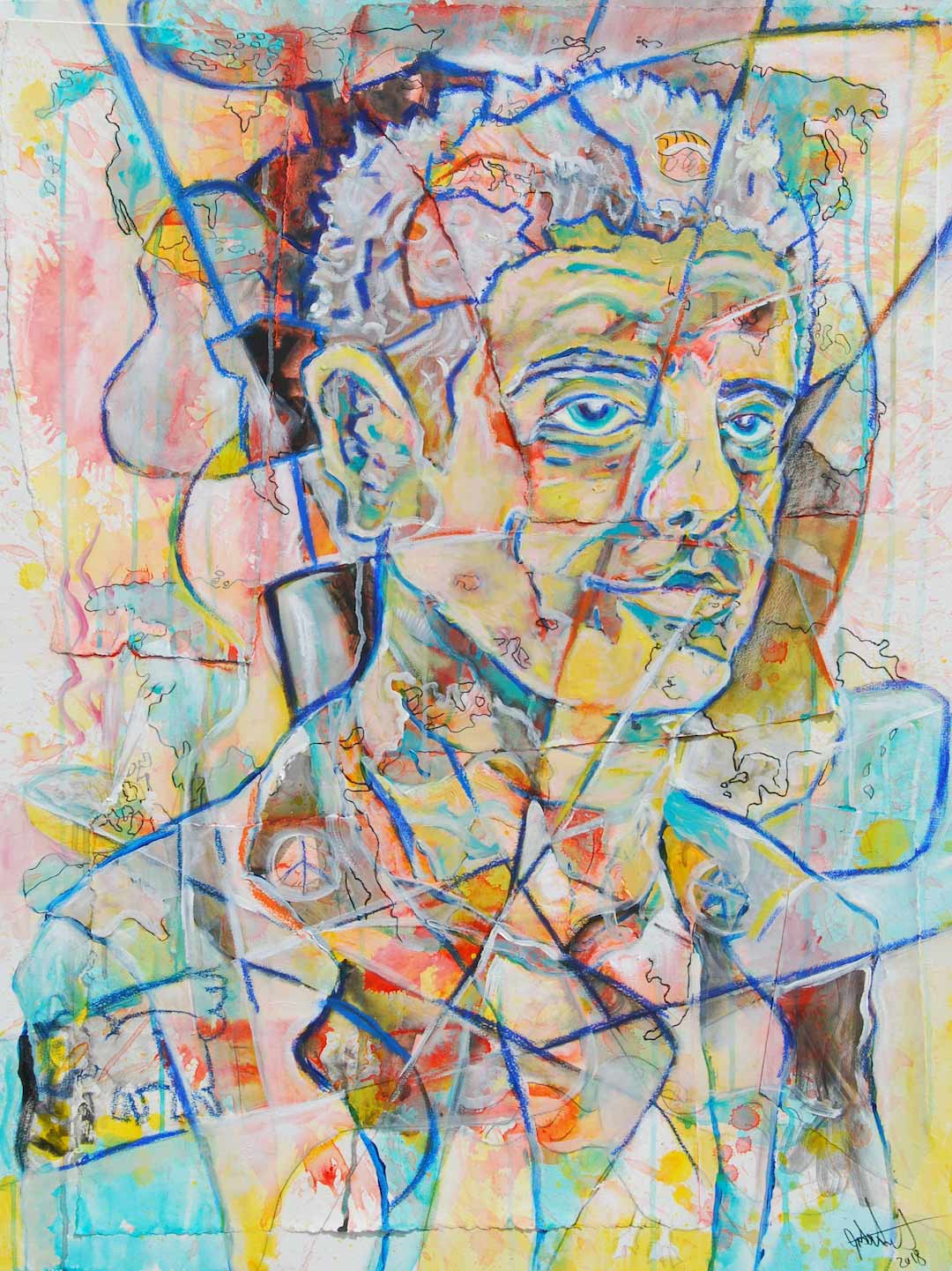
Paintings where I initially began to explore more open visual space
The visual approach I took in creating this portrait also helped to inform the approach I would take for this project. I also moved in this direction for this painting and this painting. Aside from what I’ve stated in my artists statement, there’s something to be said for my artistic tendencies being an extension of varying levels of OCD I’ve experienced as a teenager. Moving in a direction where I gradually open space may be a way of moving beyond that.
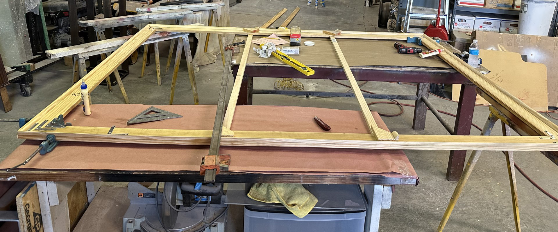
Time to begin: Stretching the canvases and the initial acrylic ground pour.
Working with my father, two 72″ x 96″ stretcher frames were hand built. Materials were acquired from a local Dallas lumber yard and home depot. Unprimed canvas was then stretched around the frames and later primed.
While I like this painting ok, the creation of it felt somewhat more random than the others and I wasn’t sure how that would translate into a larger scale. I didn’t think the colors and composition were a fit for the project.
Elements of that painting informed this painting, which proved to be a much stronger solution. Mostly the colors were slightly more subtle.
Communicating the absence of visual space to create more ‘minimal’ visual dynamics
In some contrast to previous paintings that I have created, there was a focus on capturing more open or negative space than previous pieces. In a vein similar to Debussy’s or Mile Davis’ quotes about ‘the notes you don’t play’, or the spaces between the notes, I was able to capture a striking visual dynamic. The focus in these paintings was on broader and simpler shapes with ‘hidden’ references to iconography.
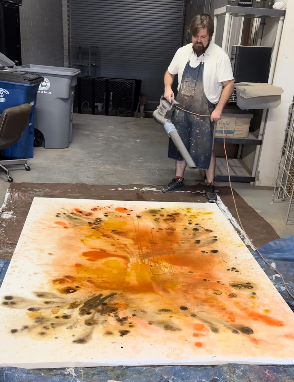
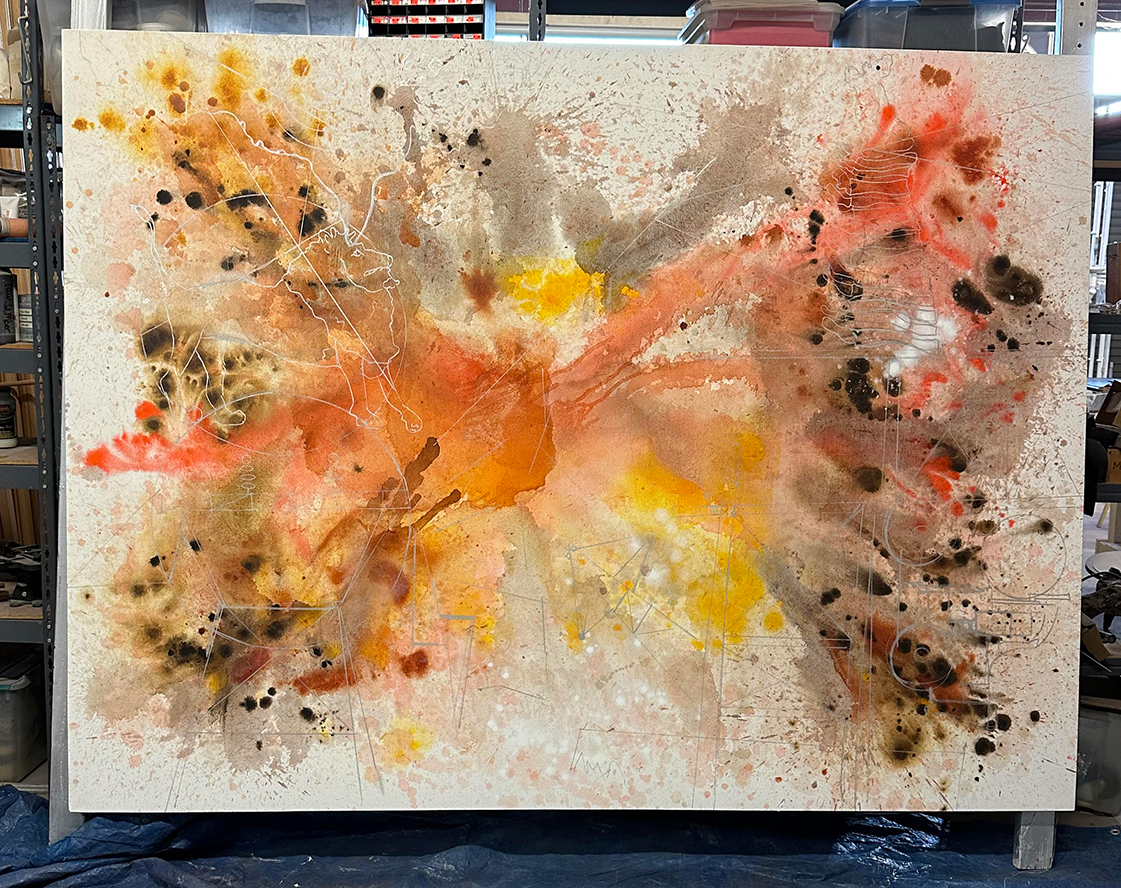
The acrylic pour stage
In the first stage I pour thinned out acrylic (using a combination of water and acrylic medium) to create a ground. Going through this process establishes energy, texture, and lends to visual depth later. A couple of days were taken to re-create the same look and feel of the smaller artwork.
At one point at my father’s suggestion, I used a leaf blower to push around the drying paint. I said “why not? I’ll give it a shot.” Minor variations in the energy of the work did occur, but mostly it was a good bit of fun. Here you can see the part of the process where I translated the drawings with a silver-gray acrylic paint pen.
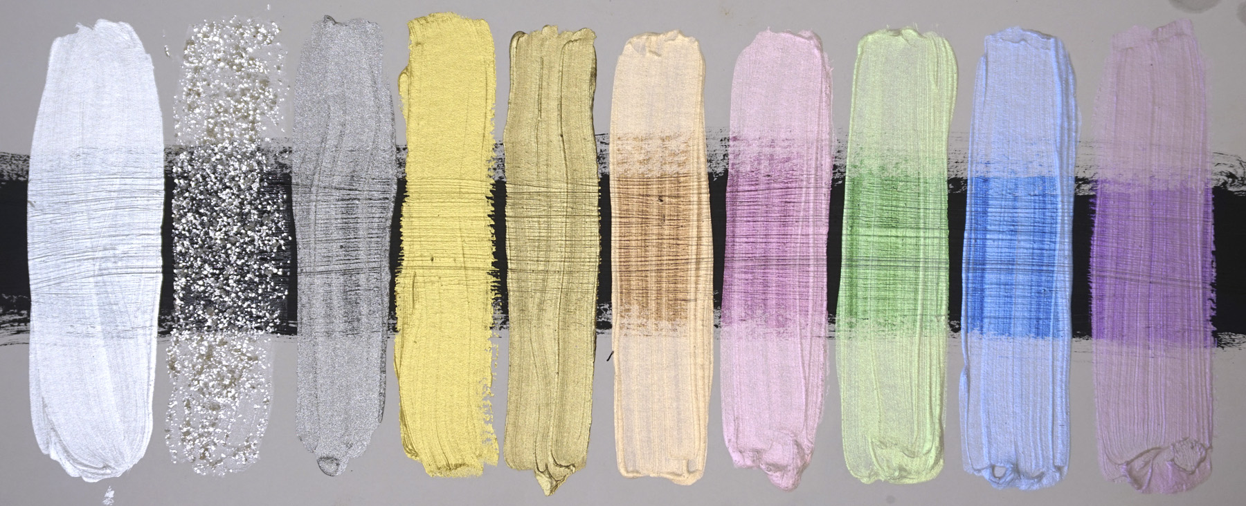
‘Hiding’ iconography with interference paint
While not all images were obviously hidden, I was able to incorporate the use of golden artist acrylics ‘interference paint line.’ This image shows how these pigments look on differently colored surfaces
Transitioning into the larger paintings
The process of creating the larger paintings went fairly smoothly, given that I had put a lot of work into planning and developing what I wanted the painting to look like. There’s always a little bit of a concern along the way that there might not be an exact translation from the planned work to the final. However, I soon found the confidence to execute first painting.
Painting at a larger scale and making minor adjustments
The first painting was more or less directly translated from the concept painting with minor improvements. Mostly, adjustments in scale to certain elements were made. This was to the benefit of the finished piece, and I could focus on refining details in the larger painting. I relied less on tools like light projectors and did more work to translate directly by observation.
The second large painting
The second painting proved to be an interesting experience. The process of translating the pencil sketch proved organic and rewarding partially because I had no pre-conceived notion of the end result beyond making it match with the first painting visually.
One painting could not really exist without being a natural progression of the other, but it was interesting to see how much more comfortable and confident I got with my creative process as I moved forward, and how that effected the rapidity of production.
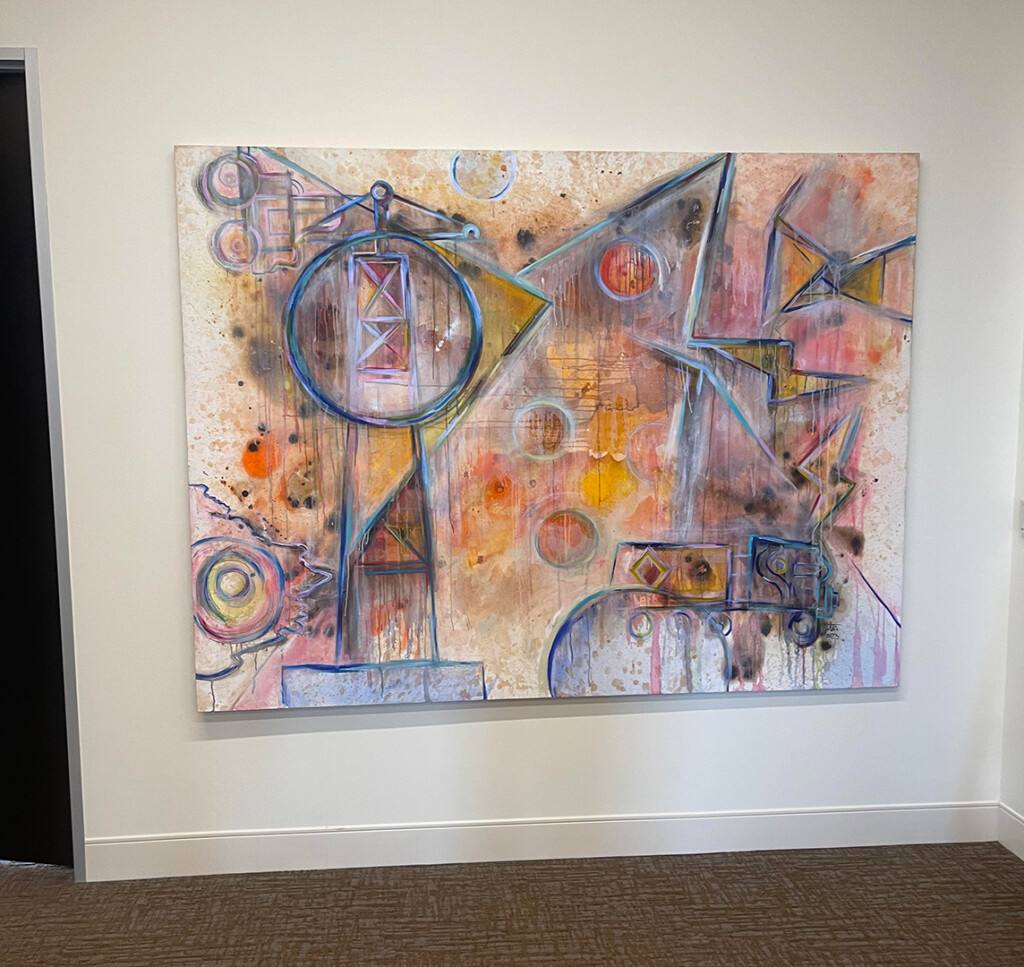
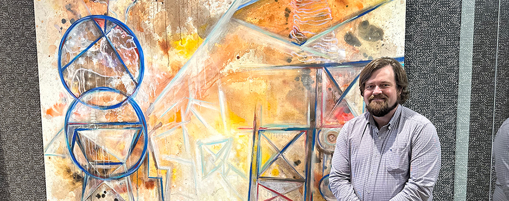
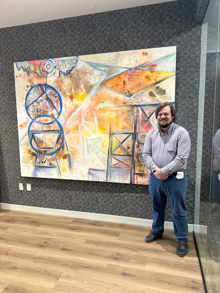
The finished paintings installed in the office
The initial reception of both paintings were positive. The client did choose to include the first painting, rather appropriately, for the 12th floor. The second painting was later added to their corporate collection on the 19th floor. While I do consider these two paintings sister pieces, the second painting’s texture and color does make it a better fit for that space.
Thank you
I want to express my gratitude to everyone involved in making this project a success
A special thank you to everyone at Lyons and Simmons LLP. I also want to thank Laura at LMD designs for collaborating to place the second painting within her design. Lastly, I want to say an extra special thank you to Amanda Hill Interiors for introducing me to this wonderful client during out initial collaboration in 2020. I also want to say thank you to my father Michael Stallings for helping me in putting these paintings, as well as Tabatha Hamm for her assistance. Avance moving and storage also did a great job assisting with logistics and installation.