New abstract art for August 2017
Click the thumbnails above to see more
This series began with the intention of creating a single stand alone portrait. I set out to initiate an abstract portrait of friend and fellow artist Jacqui Sommerman. In this case I will need to move beyond a conventional portrait given her bright personality. I have decided it would be best to go outside my normal process and comfort zone.
I want the color scheme to reflect her personality. This means the colors will be bright, but eccentric. Some influence will be taken from surrealism and cubism. There’s been a real sense stream of consciousness approach in building the ideas within these paintings. The original concept behind Picasso and Broque’s initial cubist period dealt with relativity. They were trying to distill 5th dimensional perception into a two dimensional space. To better illustrate this, think of a single figure being displayed in different points in time simultaneously.
I won’t divulge other imagery I am going to be using at this time, as I want the paintings to have some time to develop. It will be a combination of references to things that relate to the subject matter and some things that are randomly chosen from my day to day life. I want to do this to create a sense of spontaneity.
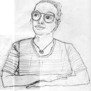
This drawing was scanned then transposed to the canvas via transfer paper and a light projector.
Abstraction of the figure can be a constant process of finding a middle ground between expressive design and a literal interpretation of the human figure. It’s a process of letting your imagination take over. Many of the ideas I came up with for these paintings would percolate while I was doing other tasks. While working or doing laundry, I would slowly have ideas pop up in my mind for what I would like these paintings to become. While I put these ideas to the canvas, I am sure there will ultimately there will be many changes. I’m looking forward to being surprised by changing my process up some.
I will be including acrylic, pastels, watercolor, gouache, and ink in these paintings. Some areas may be light, even white on white. Other areas of the painting will be utilizing very bright colors such as green, yellow, orange, and a dark magenta. The goal of this painting will be for the schemes that clash to some degree. The point of this will be to challenge myself to build something that “works” with elements that are not supposed to go together.
I am currently hard at work on these two paintings and I am extremely excited to show you where this project heads!
Jacqui and I are part of a local Dallas artist collective known as 2nd Thursday.
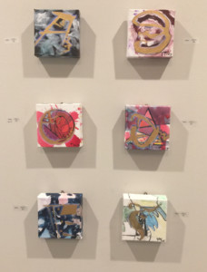
Lettering series
interpreting the English alphabet
Initially I thought I would end up creating my own language. I had some discussions with Peter Ara Guekguezian at the University of Southern California to get some more insight into the mechanics of written language. I wanted to take my time and learn a bit about linguistics before diving head first into such a deep subject. Even if I still improvised, it was important to gain the knowledge first, then create.
Taking influence from other languages
After chatting with a fellow designer and long time close friend Eric Sharpe, I came to the conclusion that I needed to keep my letters grounded in a language people understand.
I created a set of rules where consonants are more angular and geometric. This is somewhat akin to Asian languages like Korean or Mandarin/Cantonese. In English, these letters sound somewhat less stiff. I thought this might be an interesting counter point and I wanted to see where the linguistic rabbit hole went. Vowels on the other hand are much more expressive and curvilinear. These letters may or may not sound this way in English, depending on which letter you are talking about. Again, the whole objective is to create a visual counter balance.
I kept a daily sketch journal to get the backgrounds and patterns down on paper before I laid my lettering to canvas. This allowed me the freedom to not think within my normal visual creative process. I wanted to be free to come up with new visual ideas to use now and in the future.
Challenging typography and readability
Typography is traditionally concerned with readability first and foremost. While I can understand why this is the case, I’ve always wanted to see how far I could stretch this rule while still keeping a character like a letter close to recognizable.
The letter C was recently sold an an Urban Scene event!
I have participated in pop up events with a local organization, Urban Scene, since 2015. in March I displayed my work as a part of one of their multi artist event. An individual purchased the C letter in this collection. Big Thanks to Landon and Thani Burke for continuing to support me with these events.